This week we interrupt Mercury’s dice-trivia series—featuring Die, die, die! and Unfortunate Dice—to give you a quick update on some of the things we have been working on to get theming going!
The themes preview of two weeks ago show our goal with the theming feature: to support multiple color schemes for the Picard theme. To get colour themes going, we need to be able to change the colors of most visual elements of the campaign site… And as it turns out, there are a lot of colors involved, many of which we set without really noticing that we did. To give you an idea, we will be dissecting a button in this blog post.
So, let’s start out with looking at, and interacting with, a live specimen:
This is a button with the primary styling. This kind of button is used for the default action. Saving a wiki page, posting the forum post, and other actions where the player is done doing their thing, and now wants RPGpad to “do the thing”:
You can safely click it a few times to get an idea of how the appearance of this button changes when you use it—this demonstration button doesn’t do anything. Notice how the button change color when you click it, and retains a light blue outline when after you clicked it. All in all the five states for the button to be in—four of which you can get with the live specimen above—are displayed below:


A button can be in one of these five states. “Normal” means the button is just sitting there on the page. When you move your mouse cursor over the button it gets the “hover” state. The “focus” state is what you get when moving the focus with the tab-key in the keyboard, or after clicking the button. “Active” means that you are clicking the button, it is “active” while you are holding it down. And finally, “disabled” is when the button cannot be used.
To make the button look like it does, we have to pick several colors that work well together. To get an idea of the colors involved, let’s zoom in on the “focus” state so we can have a clear 10× zoomed view of the button:
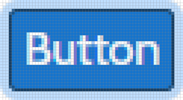
As can be seen from the zoomed in image, there are at least four colors involved:
The outline color to show that it has focus,
a border to clearly delineate the shape of the button,
the button color itself,
and the text on the button.
We are going to ignore the additional colors and surrounding the white letters since we do not have to pick them ourselves, they are due to the subpixel rendering of the text.
Now that we know the colors for the “focus” state, let’s see what additional colors we use in the “normal”, “active”, “hover”, and “disabled” states:
“Normal” border color,
“Active” button color,
“Disabled” button color,
“Disabled” text color,
“Disabled” border color.
Basically, for each state we need to define colors for the outline, the border, the button color, and the text—of course, some of the colors we pick can be the same for some states. So we pick about 8 colors for the button… And that’s the first of five button types done, only four more to go:


For just the buttons, we need to pick about 5 × 8 = 40 colors. There’s also colors that need to be picked for all the other things you can see on your campaign site, from the background color of all pages, to the color of the notices for unread announcements—and for each different color scheme we need to make sure that we have colors that work for that scheme…
As always, this week’s changelog is available to get an idea of the exact updates to RPGpad.