In parallel with the improvements to the pathfinder system support we have been working on theming. In this blog post we want to give you a preview of what we aim to achieve with regards to thematic customization of your campaign!
Currently, there is only a single “theme” available to all campaigns: the sterile plain-white default. In our internal communication this single theme has been nicknamed “Picard” because of Mercury jokingly explaining the features of the theme as “having as much atmosphere as Captain Picard’s head”.
The final goal is to have multiple themes available, allowing you to pick the one that best fits your campaign’s feel and atmosphere. For now, our immediate goal is to to make the Picard theme customizable.
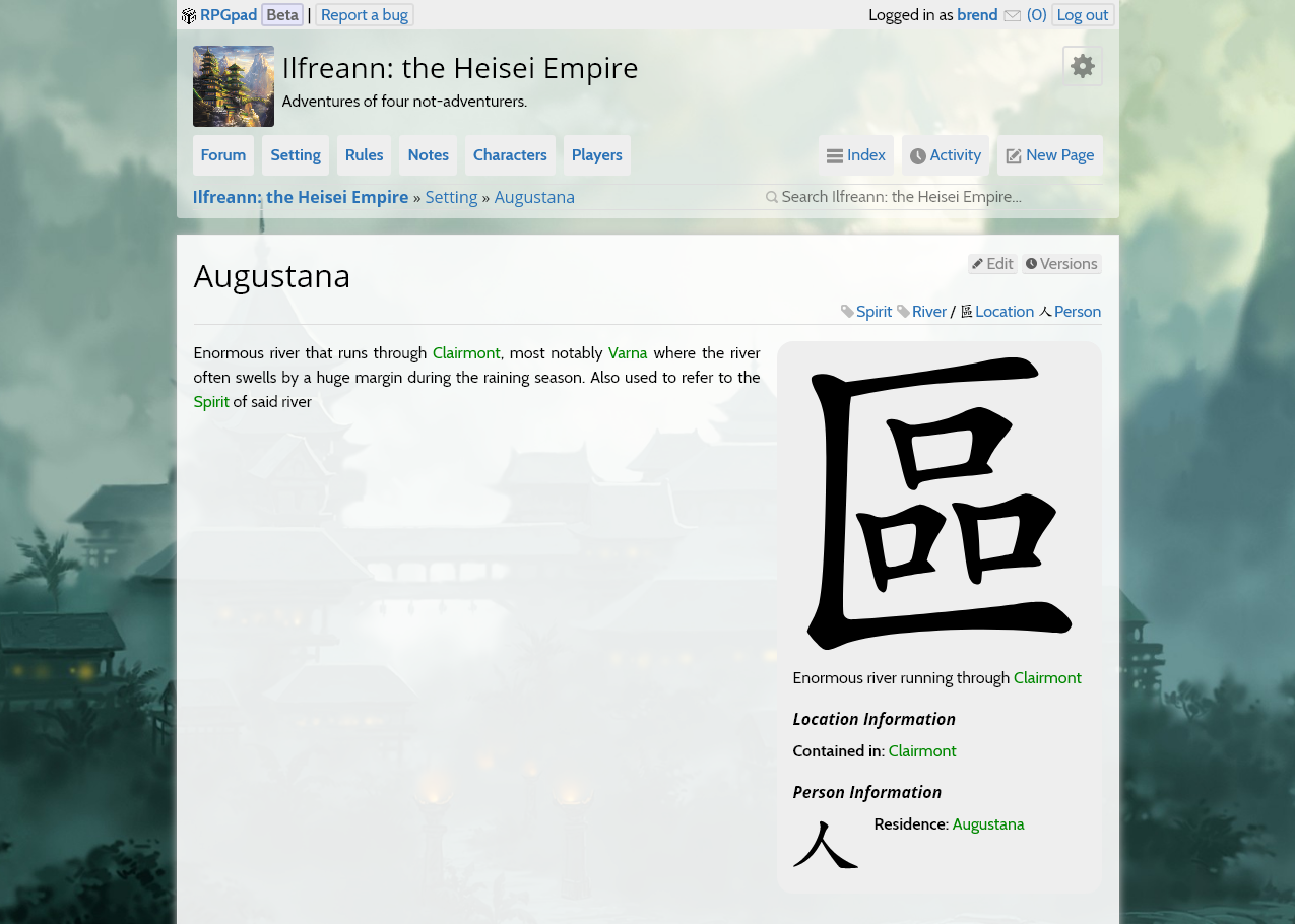
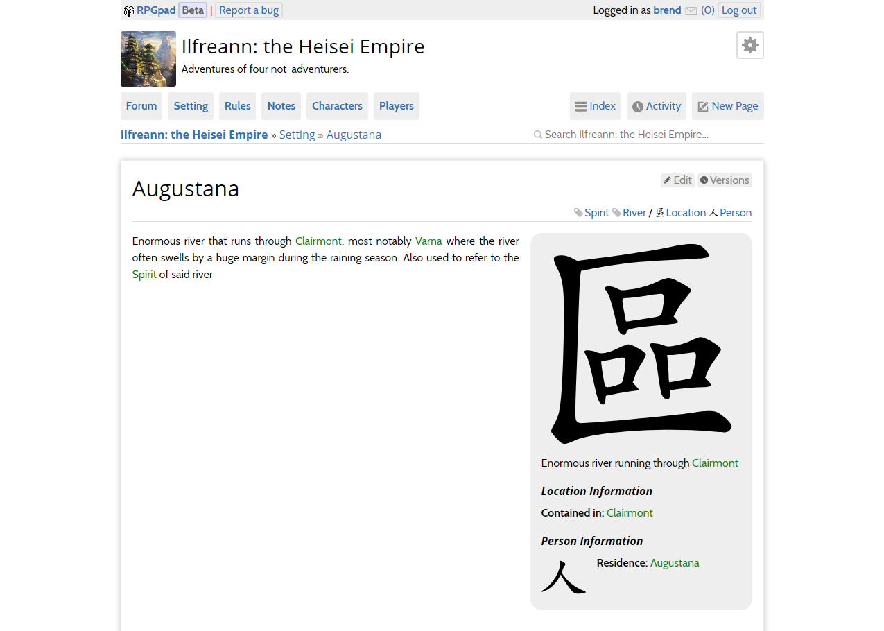
We have been researching how different customization options impact a campaign’s atmosphere. The quickest way to get you the most customizability is to add a theme configuration option to add a background:
As seen in the above two screenshots, just adding a background image is an immense improvement.
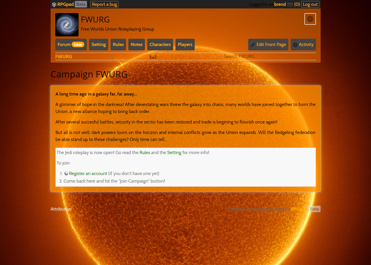
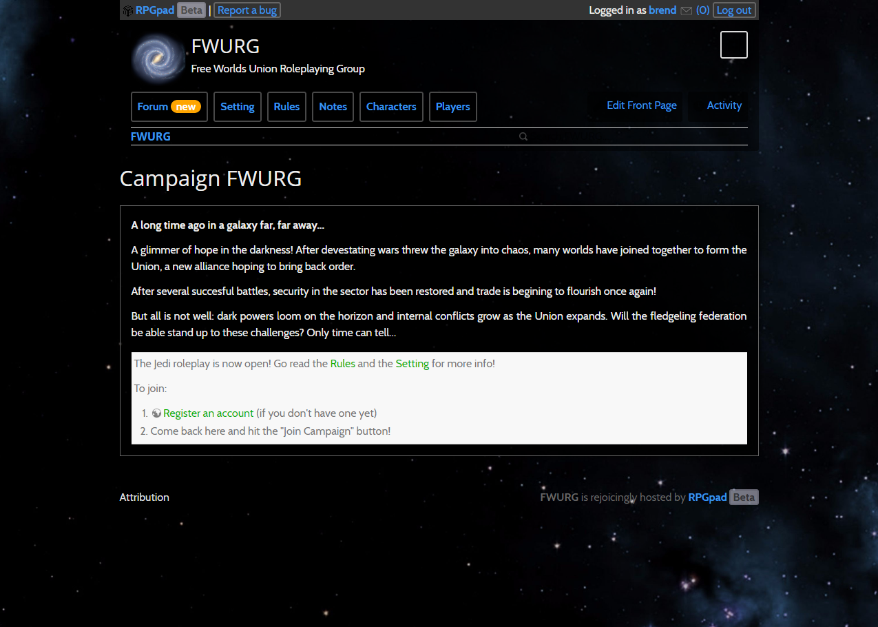
Customizing the theme will be done by uploading a background image for your campaign and configure the colour scheme. This immediately gives you a lot of customization freedom:
As you can see in each of the configured screenshots uploading a background and combining it with a colour scheme makes the campaign look completely different; even though the layout remains the same.
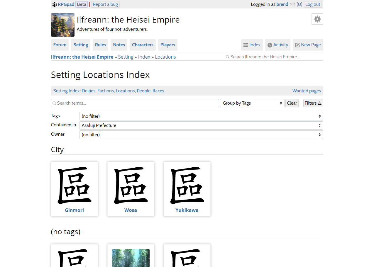
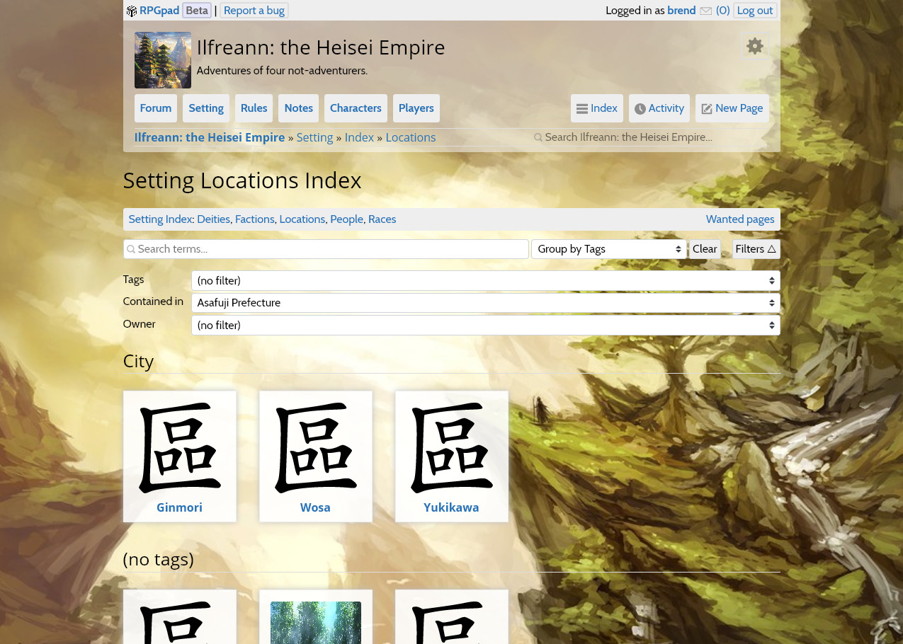
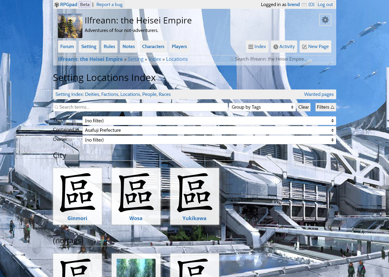
Adding the ability to change the background image does have some implications for how we should do layout, and the amount of visual clutter we have to deal with:
In each of these screenshots you see the Location index of the Ilfreann campaign. In the first screenshot there is nothing to distract you from the index entries and the filtering inputs. While the layout is not perfect, it is workable. The second screenshots presents a workable page, with the group titles and the filter inputs still readable. But the third screenshot… Well, that’s just a horrible mess.
We want to make sure that you can use the background image you want to use, and that only the most eclectic of choices — such as an image of alternative slanted black and hot pink squares — produces “bad” combinations
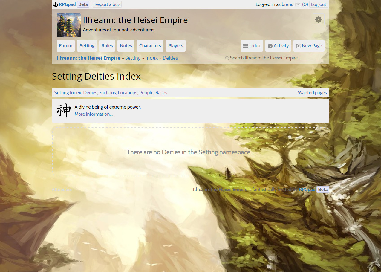
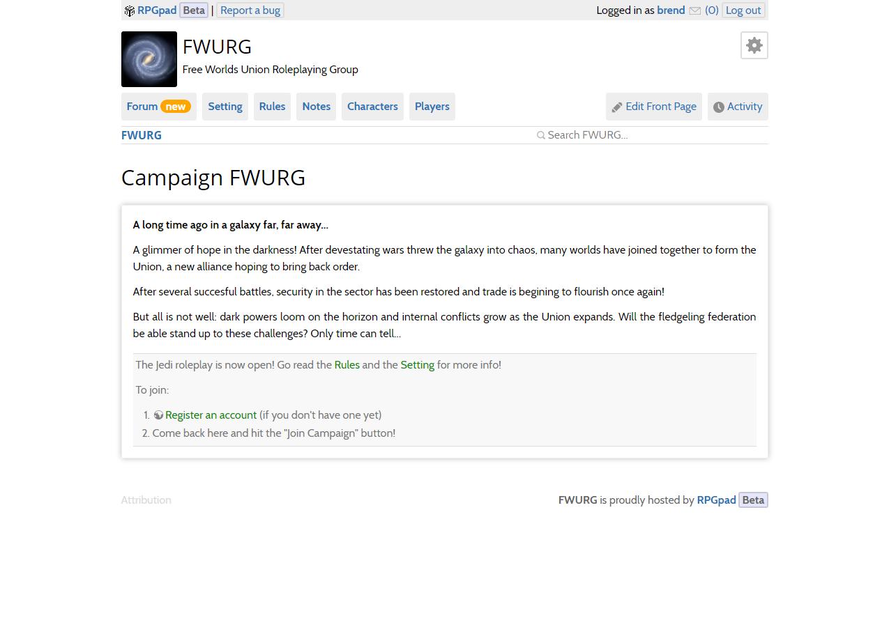
There’s still a way to go, because next to making sure that all pages have layouts that work with different types of backgrounds, there’s alot just a lot of different visual elements that need be adjusted to work with colour schemes and background types. One example of the “empty state” marking as seen in the screenshot to the side. Another example is the out-of-character block in the Cityscape, Sun and Stars examples above: while the default style works in the first example, it gets gradually worse in Sun, and it is just painful to look at in Stars.
Next week, we will tackle these problems and work on getting you these customization options for your campaign!
As always the exact changes, including details on the new improvements to the Pathfinder system support, are available in this week’s changelog.
