In a previous blog post, Styling Preview, we looked at some of the styling issues that popped up on different devices. Today we have most of those issues under control, and I would like to talk about the differences between the new and the old styling.
The display of forms The way forms are displayed with the new forms works the same for everybody. The benefits of this can be seen by comparing the following three screenshots to those in Styling Preview:
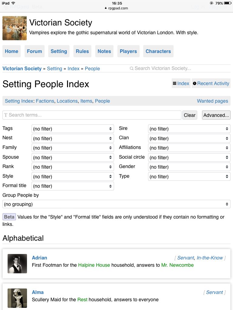

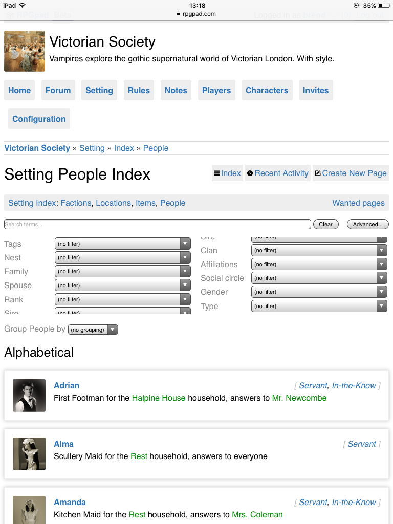
Once again, you can click the screenshots for a larger version. As you can see in the first screenshot (before, after) the filter fields are now correctly balanced, and are no longer chopped up.
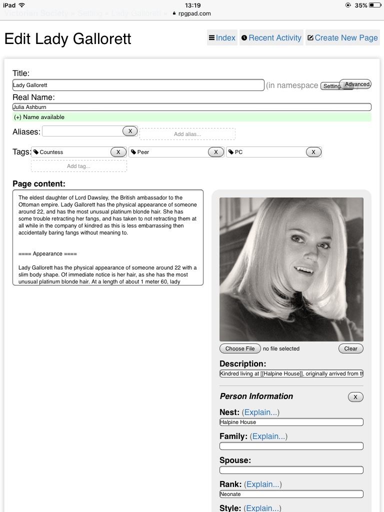
In the second screenshot (before, after) the main problem with the large text area has been cleared up, and the strange placement of the “Add alias…” button is fixed. We are not completely there, as can be seen with the “Advanced…” button in the upper right: that one still overlaps the wiki selection dropdown.
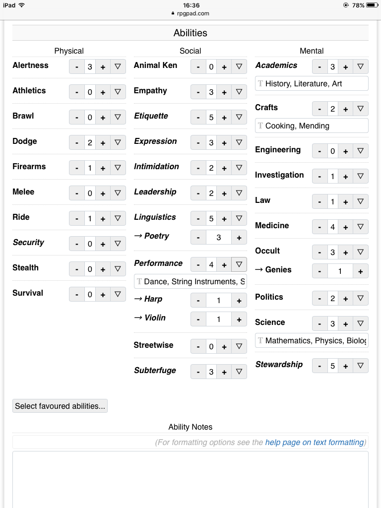
The third screenshot (before, after), showcasing the ability editing part of a Vampire the Masquerade character sheet, is a big improvement of overall layout and clarity. A large part of this improvement is due to the selective hiding of things that are less relevant. An example of this is the hiding of the Favoured Ability checkboxes; they can still be used but must first be displayed via the “Select favoured abilities…” button. Hiding these also prevents players from accidentally changing the favoured status of an ability.
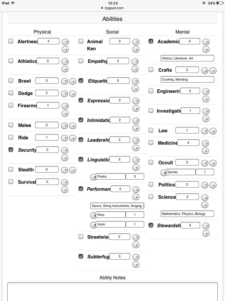
Little icons We have also opted to add little icons to many fields. These icons indicate how RPGpad is going to use the field, and will help with showing new players and storytellers what they can expect from RPGpad. Most of the different icons can be seen when editing a wiki page. For now, we’ll see how these little icons pan out without much explanation, though we do explain their meaning in the new help pages.
In the future, we want to improve these input fields with auto-complete and other automatic assistance that fits the type of input field. This will make the association between the little icons and the field types stronger, because at that point you can easily see that any field with a little chain icon will auto-complete your links for you.
Overall, we are very happy with the change. While there are still some quircks to be worked out (as there always are with new features), the new forms have already helped a lot in improving RPGpad for everyone! As always, if you want the nitty-gritty details of the changes this week, or of you just want to comment on something, head on over to this week’s changelog.