This week we’ve been preparing to tackle an issue that has been bothering us for a while now: the display of forms, and the amount of space taken up by the “top” of each page.
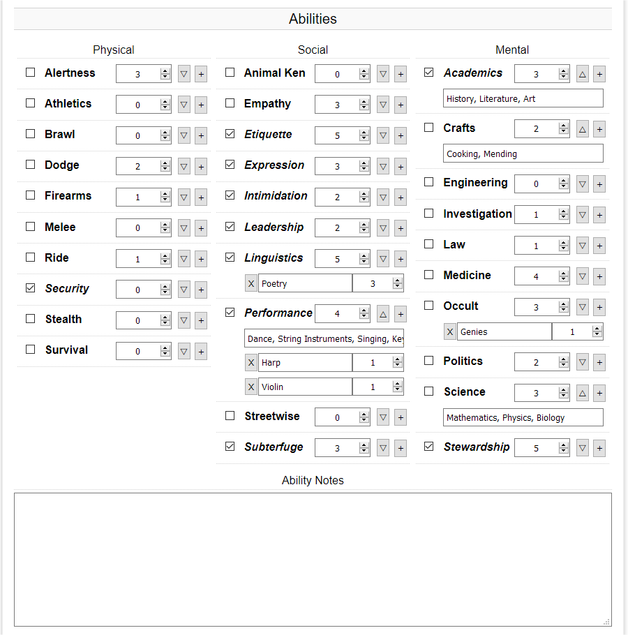
The display of forms The way forms are displayed right now works for some people, especially those with nice large screens and modern desktop browsers, but does not work well for others. These issues are best illustrated with a few screenshots, so let’s play “spot the issue” with the following screenshots:
You can click the screenshots for a larger version. When you are done spotting the issues, let’s go over them. I’ll list only the most egregious errors to keep this blog post short:
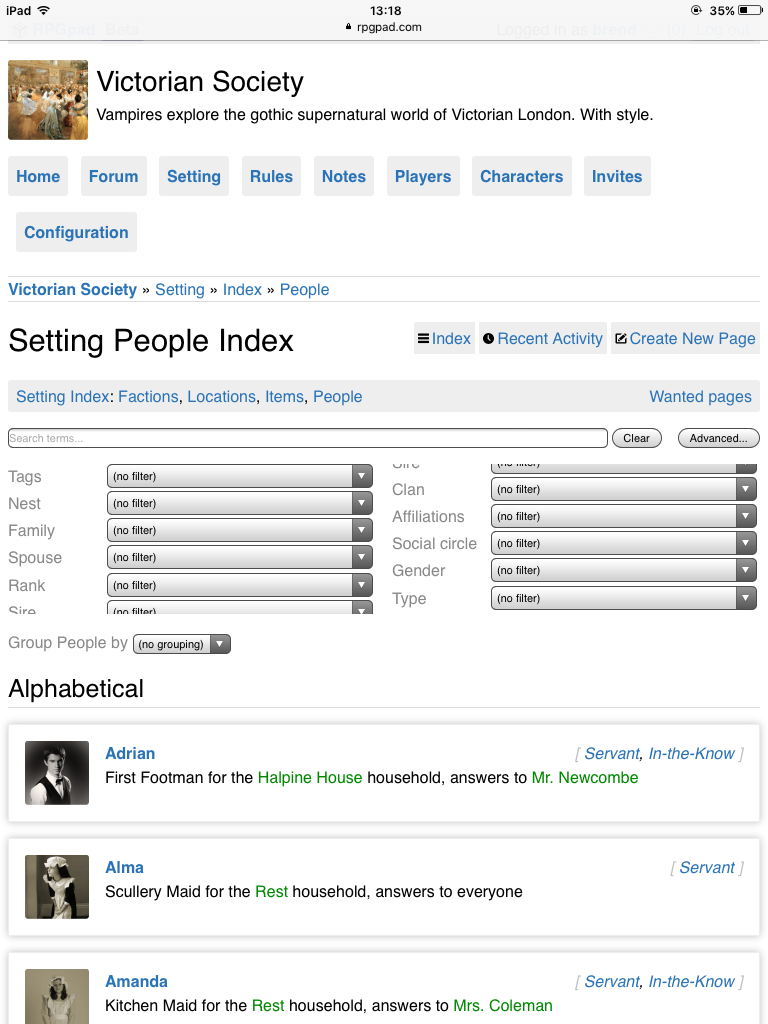
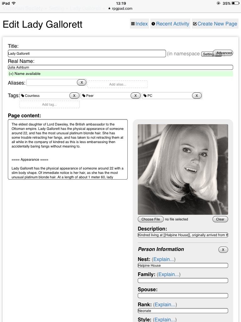
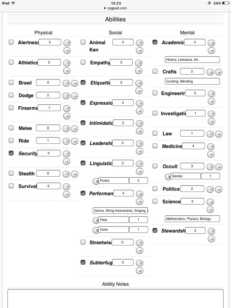
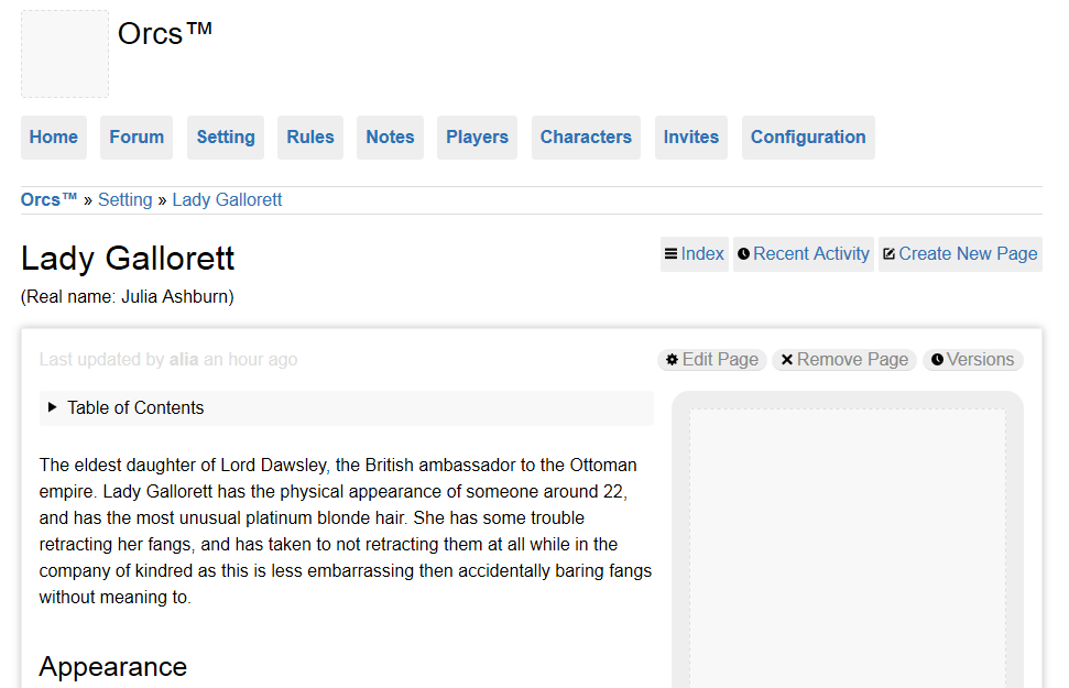
In the first screenshots you can see that the two columns of the filters are perfectly balanced—in the sense that both columns are exactly equal in height. The second screenshot showcases several issues with wiki page editing. Chief among them is the smallness of the text editing are. And the final screenshots clearly illustrates the issues with a VtM character sheets. The character sheet should be much more like this clean display, which itself has some issues as well.
There’s more issues on display! Feel free to make a post to point them out 😉
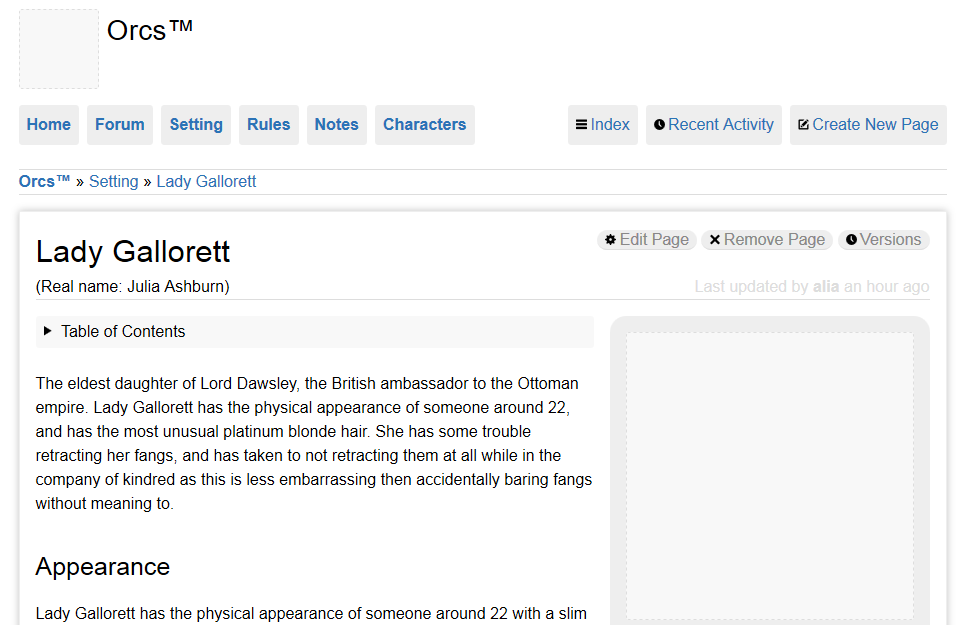
The top of the page The second offender is the top part of the site. Right now, a lot of vertical space is taking up by the top part of the site, which means that there’s a lot of things in your view before the actual wiki page or thread starts. We want to change this.
To give you an idea of what this means, I have made a before-and-after comparison based on some preparation mock-ups we made:
Once again, you can click the image for a larger version. As you can see, the “after” image reduces the amount of buttons on the navigation-part (the left part) of the menu bar, and adds the relevant context actions to the right part of the menu bar. This frees up a lot of space to put the page in immediately.
The after version also reduces the amount of visual clutter by putting the page title inside the page border, and adding the real name and the last modified date inside the page as well (as they are relevant to the page).
Of course this is just a mock-up. We are still thinking on how this works out for things such as tags and forum threads, but the overall direction is clear to us.
Next week we will start to get these styling changes to you! We look forward to improving the site, and if you have any comments already, we’d love to hear them, so please let us know!