This week we have been chipping away at the issue of form appearance and styling. In last week’s Bugs and Styling post we showed a quick preview of the progress on the search fields.
Today we want to show you the things we are trying, and what we feel works and does not work.
Please, write on the dashed line… We were not happy with the way the search fields were displayed last week, so we set out to find another way of styling them. After some experiments we found the following:
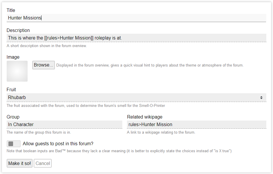
There’s several new styling things happening in this image. The first being the dashed underline for each form field (except for the first field, which was just clicked on).
Everywhere in the site these dashed lines are used, they are used to show that something is clickable or usable. We continue this by making the form fields use this style of line as well.
In addition, we have made room for short additional texts under the fields. This allows us to add some hints, or a quick description of how the field will be used. We think that this addition will be very useful.
While we are very happy with these fields like this, they do come with a disadvantage. We currently use a lot of grays, for example when you edit a wiki page, the infobox where you edit the page’s description, image, and person fields (if the page describes a person), is also gray. Additionally, when clustered together in larger groups these fields can feel “heavy”.
Boxed fields for clarity… Given that we have a lot, and I do mean a lot, of input fields in the RPGpad system, we are looking for a uniform visual style that indicates “this is a field or input that you can use” to everyone using the system.
Given that we want all places where such inputs show up to look the same visually, we went back to the “all fields have a line around them” style. This makes it easier to have the field look the same in all circumstances:
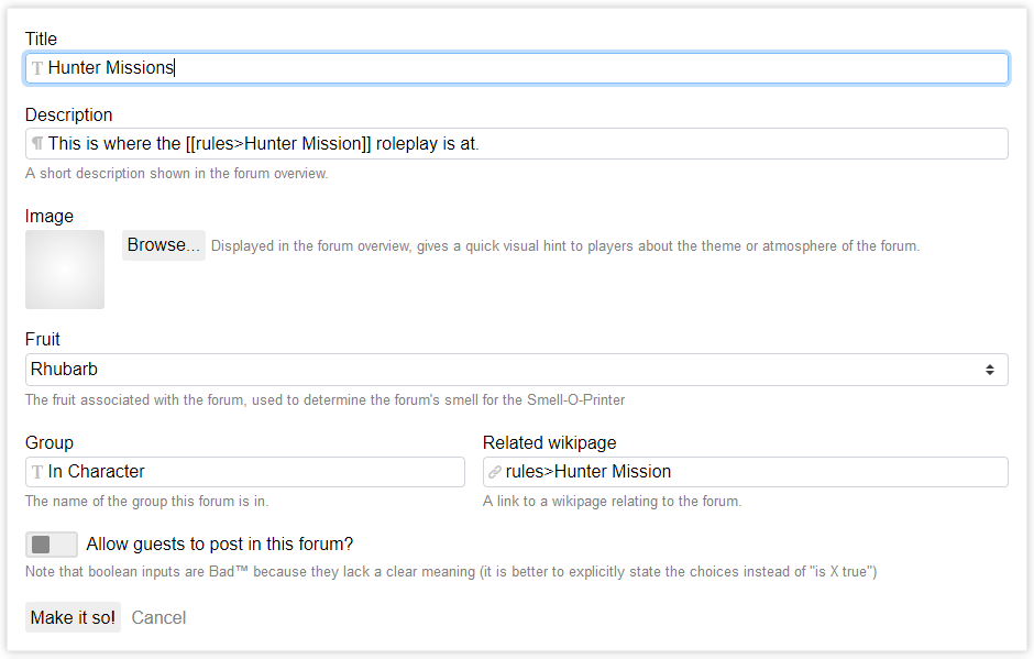
Here, you can see the same form, again with the first field just clicked on. This style is “lighter” due to a lack of larger surfaces of darker shades. This style is also more familiar to many people, which is an argument in its favour.
Additionally, we have also experimented with little icons in the fields that indicate how RPGpad will handle the input in the field. This is based on our experience with the new-ish tag fields, which all have a small tag icon in the field.
In the screenshot here, for example, the “Title” field is a plain text field (meaning that no formatting will be done), whereas the “Description” field is a formatted field (meaning that links and styling will be understood). The “Related wikipage” field is a link field, meaning that a link will be made to the Hunter Mission page.
Regardless of what style we end up with, we think that using little icons to indicate how RPGpad will handle the field is a good plan. Especially if we do this consistently on each and every input.
Whether you like the dashed line fields or boxed fields is mostly a matter of personal preference. We are currently debating how we should approach this, and you’re welcome to join in!