This week we finished the first step of the technical colour themes rework. While most changes are of a technical nature or just preparation for other adjustments, a few of the changes are visible.
In this blog post we’ll show before and after screenshots, along with a little bit of explanation on why we changed things the way we did.
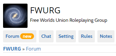
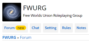
First off, we restyled the new and unread markers (before is on the left, after is on the right):
The old orange colour for the new and unread markers was only used in three places: the new marker, the unread markers, and the ‘This character sheet needs to be updated’ message. By switching over to the new colours for all three situations, we have dropped the orange and replaced it with an already existing accent colour.
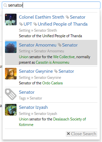
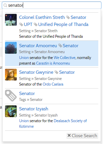
Next up are the changes to the quicksearch, with these before and after screenshots also showing off several other changes:
The most visible change is the switch from a gray focus to a light blue. This helps with the contrast, and adds just a little bit of colour when using the quick search. Gray is not used elsewhere as the ‘selected’ colour in lists, whereas the light blue is already somewhat associated with selections because all form elements are encircled in light blue when selected.
Other changes visible in the above screenshots are the new link colours which we won’t go into here because we dedicated a whole previous blog post to it, the improved contrast of the little location snippets such as ‘Tags » Senator’, and the improved contrast of the ‘Close Search’ button.
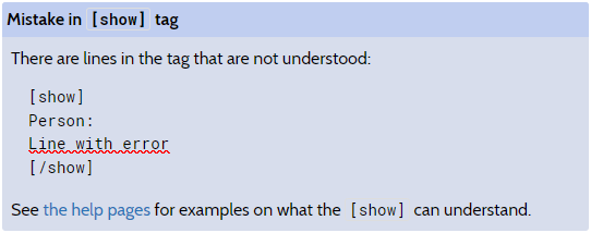
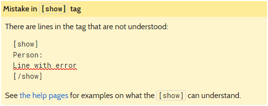
And last in the list of clearly visible changes, the change to the [show] block error colour:
We switched from a dull blue to clear yellow. Not-so-incidentally this error block was the only place this blue colour was used, whereas the yellow colour is used in other places as well.
Due to the technical changes and preparations we made for further colour scheme improvements we will be able to make any further changes in a more incremental manner. We will keep you posted on our progress in this area!
As always, we have this week’s changelog ready for you. If you want to reach out to use, to report an issue, suggest a feature or improvement, or just chat about roleplaying, do not hesitate to start a thread in our community forum!
