This week we want to talk a bit about links and their colours, as that topic is something we ran into while working on the colour schemes rework.
One of the things we want to achieve with the rework is having an easier time when creating a new colour theme. To get there, we have been going over the ‘colour uses’ of all aspects of RPGpad to see if we can reduce the number of distinct colours.
Current Situation
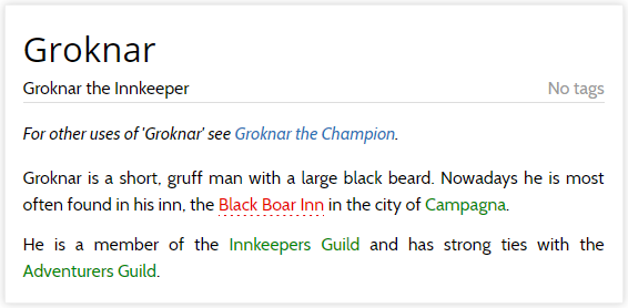
We currently have three of these colour uses for links, as shown in the below screenshot:

There are three link colours in the above screenshot, each with their own meaning:
-
— a working link to another page in texts and fields written by a player. These are the links from one wikipage to another, or from a forum post to a wikipage, or from a post to another thread, etc.
-
— a broken link to a non-existant page, as written in text and fields written by a player. These are the ‘redlinks’, links that should link to somewhere else but that do not. This can be because of a spelling error, or because the page that is being linked to hasn’t been added yet.
-
— a system link produced by RPGpad itself, instead of a link in text written by a player. These are links that are not explicitly written by a player, but that are added by RPGpad automatically. Examples are disambiguation links (such as ‘Groknar the Champion’ seen in the screenshot), links from wikipages to its schemas, the link from a character page to the character sheet, etc.
The original thinking is that working and broken links (a.k.a redlinks) need to be clearly distinguishable from each other, as well as separating system links from links written by players. The distinct difference between working links and broken links is helpful. It clarifies which links can be followed for more information and which links will get you nowhere — it also helps players to fill the fields on their character’s wiki page by making redlinks from fields that didn’t link up.
The Rework
During the rework we reconsidered the link colours. While it remains true that it is very helpful to distinguish between working links and broken links, the distinction between working links and system links has not been as useful. When browsing the campaign wiki, it does not matter whether another player or RPGpad wrote the link you want to follow, as long as it works.
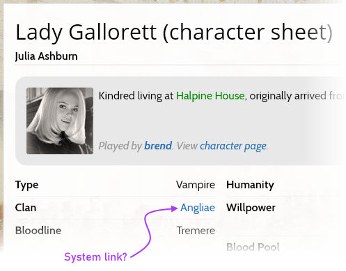
Even worse, on some pages the distinction between working link and system link becomes blurred to the point that there is no meaningful choice to be made. A good example of this is the link associated with the character type or subtype in a VtM campaign:

Every type (and clan/bloodline) in the game system configuration can be given a link. This link is clearly entered into the configuration by some player, yet the character displays it as a system link… On the other hand, if the character sheet displays this as a normal working link, a player could very well expect that they can edit the link directly when updating their character sheet, which they can not.
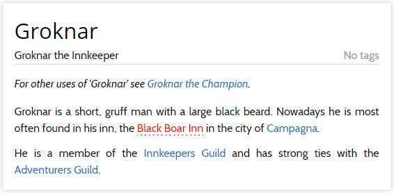
To clean this unclear situation up, we have decided to no longer make a visual distinction between working links and system links. A link that is working is just a link, like any other. Only broken links will be clearly identified:

As you can see in the screenshot of the new situation there are now only two link colours: the normal ‘this is a link’ colour to indicate that some piece of text is a link, and a distinct colour for the broken links. Of course, in other colour schemes we might go for a less vibrant red, but we will make sure that the broken links are always visually distinct from other links and hint that they do not work.
This change to link colours helps with reducing the number of colours, it reduces the visual clutter of the pages a little, and gets rid of some unclear situations. It’s a win all around!
As always, we have this week’s changelog prepared for you. And we always love to hear from you in our community forum.