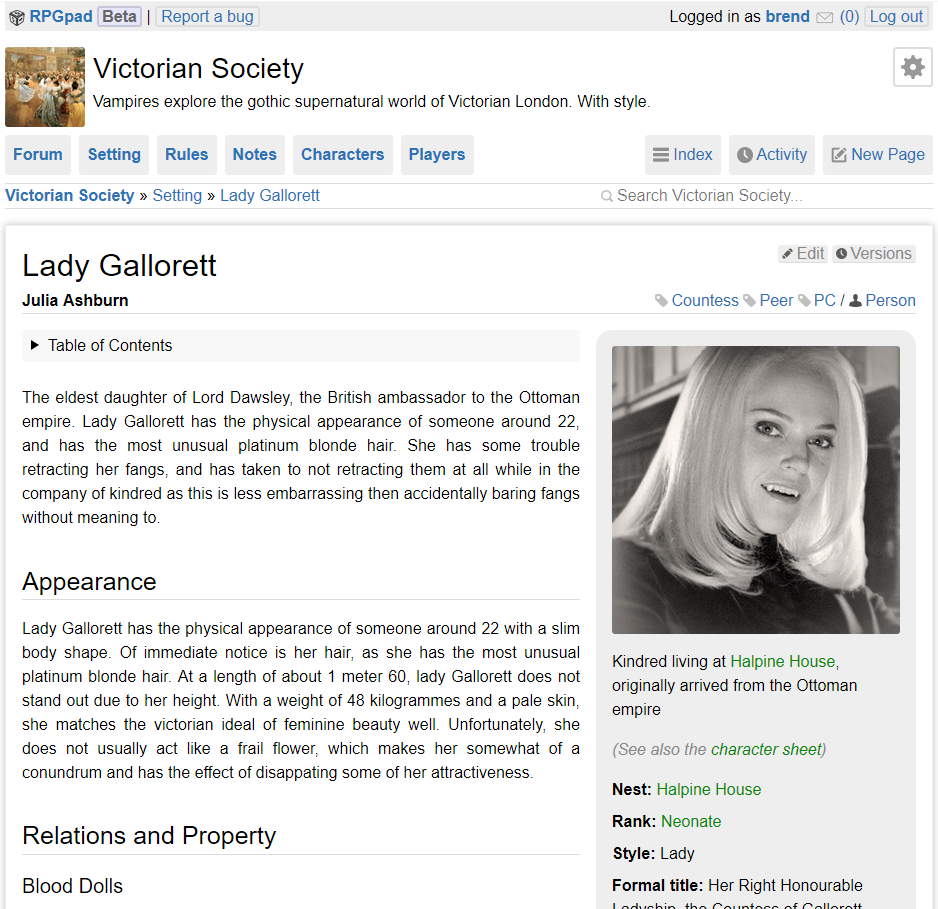
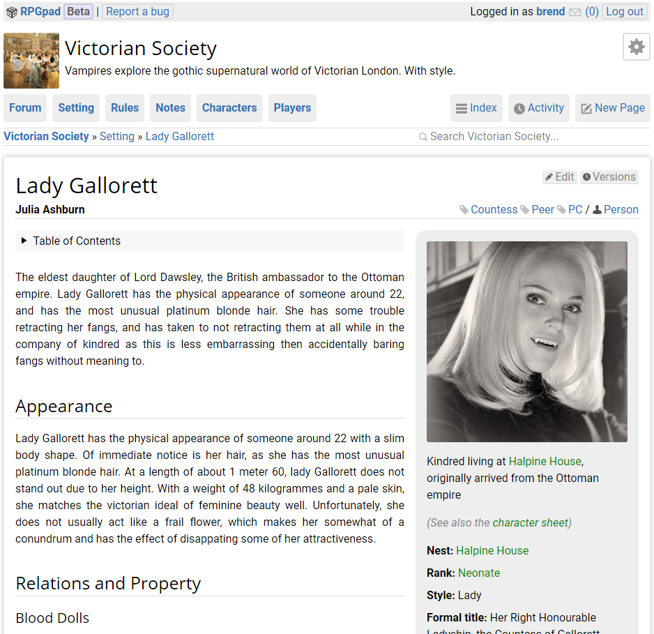
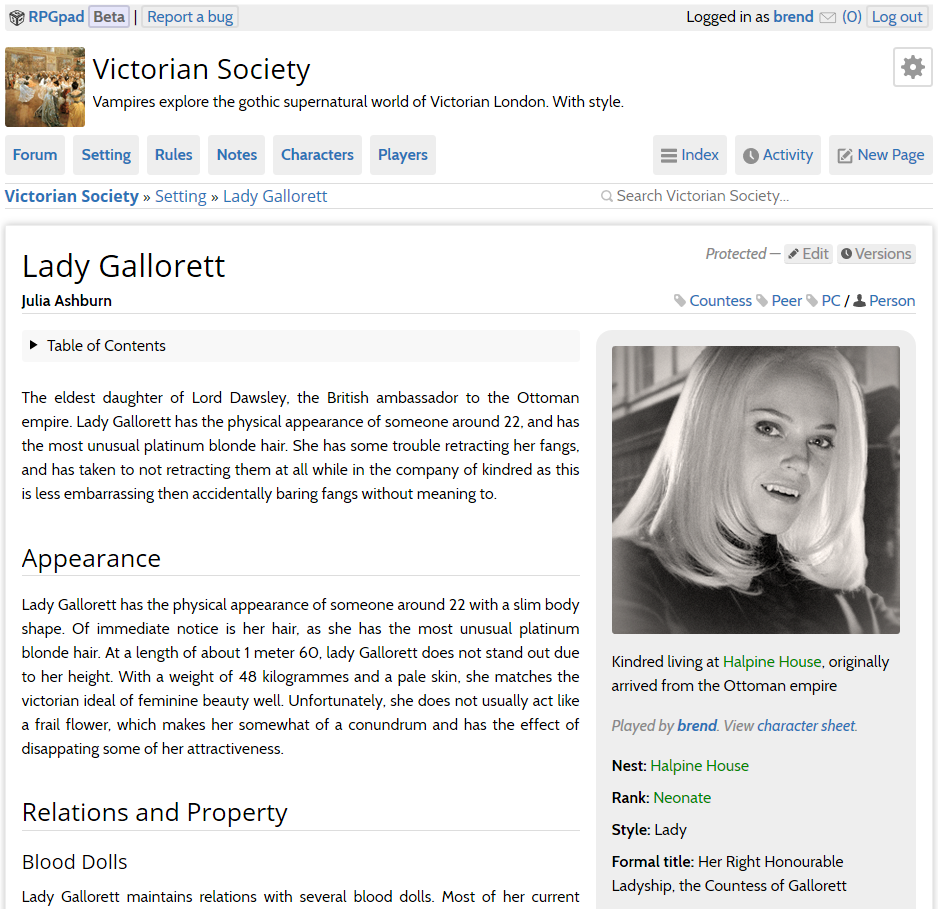
In this week’s blog post, I want to talk about a change in the change log that is deceptively small for the amount of work involved: the new fonts we are using right now.
A lot of the RPGpad platform is done with text. And while this is stating the obvious, there is some relevance to it, because RPGpad is not actually about that text. It’s about your campaign.
Being about your campaign, RPGpad should try it’s hardest not to get in the way. And one aspect of getting out of the way is to make all manner of text easily readable.
New font goals One of the tricky things about text on RPGpad is that it comes in many different usages and lengths. From a short field such as “Residence: Sprinfield” to a forum post containing a several-pages-long essay on the balance of a proposed game rules change… (I admit that I authored a few of those in my time.)
Our aim with the new fonts is to make sure that both short text and long texts are readable without problems. Normally, long texts use a font face with serif. But it is my experience that this does not work well for short text.
Due to the difference in display size, the font face used for body text and the one used for titles have different requirements. We have to make sure they are similar enough to maintain a uniform appearance while allowing the titles to stand out. That way, the page structure has more clarity, which subtle helps to absorb the information on the page.
Selecting the new fonts After spending several days exploring options and trying out different fonts for legibility and fitness for different lengths of text, we finally settled on the combination of Cabin for body text, and Open Sans for headers and titles, as these best matched our requirements.
During this process we also investigated the combination of Roboto + Open Sans. Although Roboto works well for shorter text, it requires more effort to read longer texts in it. This makes sense, as the Roboto family is designed for Android’s UI text.
Below you can compare the old “System fonts” situation with both options we explored seriously (not shown is the monospace font used, Roboto Mono in both cases):
Using Cabin as body text has the added benefit of being a little more condensed, meaning that a little more text fits in the same width. This helps to keep the menu size down.
All-in-all the new font selection is a marked improvement over using the system fonts!
Let us know what you think of the new fonts! And stay tuned, because next week Mercury will write about his work on the upcoming D20 system character sheet support.


