This blog is a day later than usual as we wanted to finish certain details. We have been hard at work trying give you a clearer view of changes made to your sheet, for both vampire and other systems.
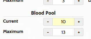
This week brings the first small improvement in that area: when you are editing your character sheet, fields you have changed will now be marked with a slightly different background colour, allowing you to see at one glance what fields you have changed.
This minor change is just part of what we have been working on, but should already help you when you are leveling your character as it shows what fields you have already completed and what parts of the edit may still need to be done. It will also make it easier to prevent accidental changes, such as if you accidentally raise an attribute score while scrolling down the character sheet - I’ve personally gone through the cycle of canceling and redoing an edit as I wasn’t sure if I accidentally changed a value I did not intend.
The feature is in support of a much bigger one we have been working on: sheet comparisons - we want you to be able to see what changes were made between different versions of a character sheet in the same way that you can do for wiki pages already. This is not just useful for character sheet updates, but it also allows you to see how much your character has grown since they started out, or since the conclusion of the last major storyline, for example.
We will continue to work on this feature, and other improvements, in the weeks to come. Next week though, we will give an outlook for 2020 and share our goals and intentions for the new year. In the meanwhile, have a look at this weeks changelog and be sure to let us know any new features you would like to see!
