The character rework discussed a few weeks ago has been progressing nicely. We are working on improving and unifying the way wiki pages and character sheets are edited.
We are unifying the editing of these two parts because editing either the wiki page or the character sheet of your character means that you are editing only part of your character—we want to enable players to edit their whole character in a clear manner, instead of having to manage multiple things.
Normally we would give you an update on our progress there, but we think that there’s something more interesting to show. So, instead of giving you a high-level overview of the current state of that work, we want to show you how we approach some of the problems we have encounter while working on the character rework.
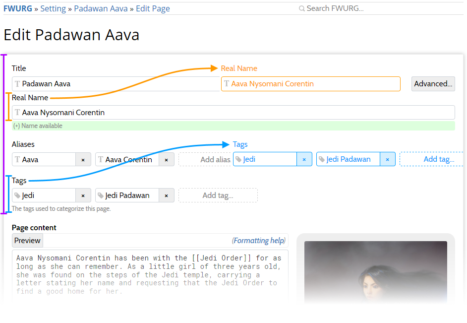
As part of the character unifying the wikipage and character sheet editing we are investigating ways to improve wikipage editing. One of the improvements we want to make is shrinking the vertical space necessary for what we call the “naming and navigation” part of the page:
The above screenshot shows the plan to reduce the amount of necessary vertical space by moving the Real Name to be side-by-side with the Title. This poses little problems, since these fields are long enough to contain most names (except the over-the-top flowery names of Abyssal Exalted).
The interesting part is moving the Tags to be side-by-side with the Aliases. The proposed layout makes sense as it mirrors the way aliases and tags are laid out in the display of the page. However, as can be seen in the screenshot, putting these fields next to each other means that there is limited space available for each single Alias and Tag.
Given that we want the layout to be side-by-side to save on vertical space, we have two good options:
- have 2 items per line and have wider fields that we currently have,
- have 3 items per line and have smaller fields.
Aliases and Tags are important tools since they help you keep your wiki complete, navigatable, and make finding things easier. We want to make sure that the layout here encourages players in all campaigns to make good use of these tools.
To help us determine what the optimal layout and sizes of the Aliases and the Tags fields, we turn to the data we already have about how these fields are used:
(X-axis: number of tags per page; Y-axis: number of documents)
In these charts, we can see that tags are mostly used with 1–2 per page when they are used. So it seems that we should make sure that we have 2 tags per line, which would cover most cases. Two of the campaigns have more prolific tag use (Victorian Society and Five Boroughs), which means that they would have many pages with two lines of tags—this is acceptable, since that would still save vertical space.
We also investigated the number of aliases per page. There, it turns out that aliases are used less than tags, so we can go with 2 per line for those as well. We have omitted the chart for the aliases per page metric, since they are really boring.
We also investigated the textual length of used Aliases and Tags to get an idea of the readability of the 2-per-line fields. We did this because the tag PC is significantly shorter than Keeper of Elysium, and if it turns out that most tags are really short, we can use 3-per-line. The lenghts of tags are somewhat spread out, but apart from an outlier of 42 characters long, most keep to 6–12 characters, so that supports our use of 2-per-line.
Based on this investigation, we have decided to go with 2 items per line for now! Of course, we can decide to change the layout if it turns out that this new layout does not work out the way we hoped.
While not every decision is investigated this thoroughly, we always keep an eye on how you are using RPGpad to make sure that the platform works for you, and does not get in your way! If you want to give feedback, or tell us about how RPGpad helps you out, let us know in the forums.
As always, this week’s changelog is available for discussing this blog post, or reviewing the exact changes made this week.
