The past two weeks we have been working to improve the header part of the campaign site. The header is visible on every wikipage, every forum thread, and every other page of your campaign.
Since the header is visible on every single page, we want to make sure that it does not take up too much space — we do not want everyone scrolling like mad just to have a look at the actual page — and also provides you with the tools you want and need for that page.
To clarify the amount of things we need to stuff into the header: it contains your campaign’s title, tagline, and image, as well as the navigation menu, the account bar, breadcrumbs and search:
Getting everything in the header while making sure the header is not too big, and remains usable and useful is a challenge. We could make it easier on ourselves and just remove things but doing so would make it more difficult for you to get around in your campaign.
So, we went through several design and attempts, and settled on the new design we just activated!
This week we also completed the changes to the forum improvements, and many more smaller things. See the changelog for details.
The rest of this post goes into more depth on the header redesign, and the reason we changed the design.
Top-to-breadcrumbs height The new design offers three major benefits, one of them is clearly visible by comparing the before and after situations:
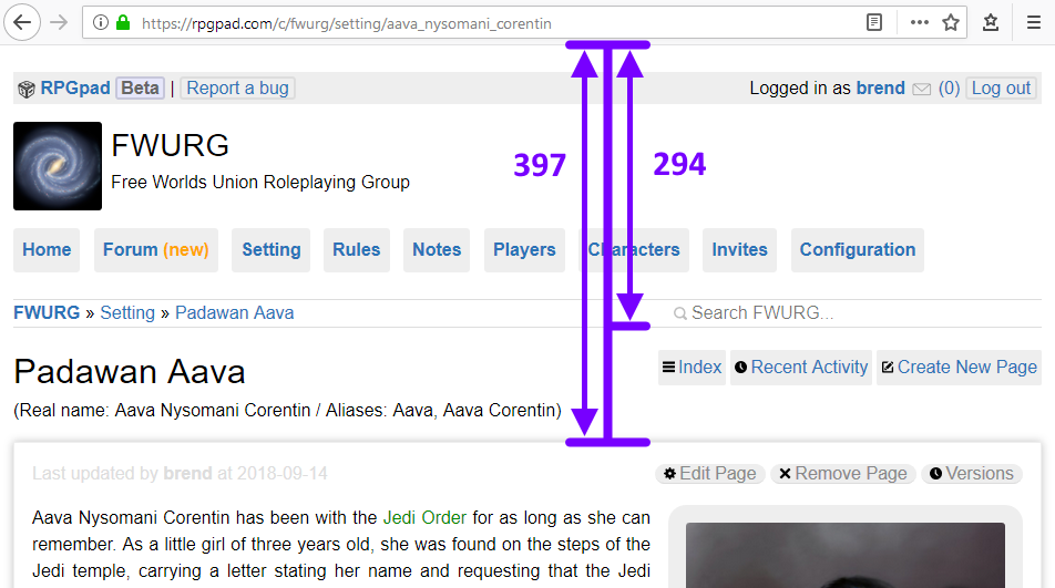
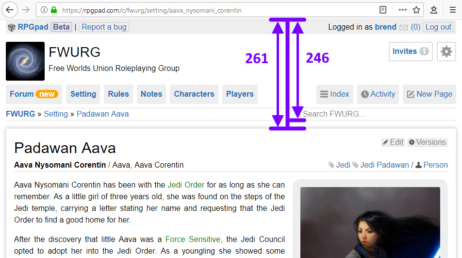
In these before and after images I have drawn a very purple measurement tool, that shows us the difference in header height.
The right numbers on both images (before = 294, after = 246) is the amount of pixels from the top of the campaign site to the bottom of the breadcrumbs and search bar.
The newer design is 16% shorter than the old, which means that the whole of the header fits into a smaller space. This means that the actual content of the page you are on — a wikipage on the city your players are in, the character sheet of the character you are playing, the forum thread you wanted to read up on in the train — begins higher up on your screen.
Page content start In the same before and after images there are the numbers on the left (before = 397, after = 261). This is the amount of pixels from the top of the campaign site to the start of the actual page content.
The newer design starts the actual content 34% earlier on the page!
To be honest, that’s an unfair comparison: the measurements measure different things, and should not be compared that way. The before measurement skips the page title, while the after measurement counts the page title as content. (Though, notably, the first paragraph of page text still start 29% earlier in the new design!)
Have a look at the before and after image again. In the before situation, you have the campaign header, page header with names and aliases, and then finally the actual content.
Compared with the old design, the new design makes the page’s title, aliases, and tags visually part of the page’s actual content. This is because, well, these things are part of the actual content. If you are at the table, and you look at a wiki page, you want to quickly see the name, the aliases and the page’s text. The new design guides your attention to these things immediately.
Better menu The new design splits the menu bar into two sections. The left part is the navigation menu, and it is the same for everyone in the campaign. Everyone can quickly navigate to the forum, wikis, characters, and players.
The right part of the menu is the “context menu”. It offers actions and navigation that make sense for the page you are on. In the example images, we are in the setting wiki, and the context menu shows “Index”, “Activity”, and “New Page”, all actions that make sense for the setting wiki.
Finally, configuration-related navigation goes into the top-right, and is only seen by players in the campaign that can configure the campaign. This is also the place that shows the number of open invites, and other relevant information for the campaign operators.
All-in-all the new header design is big improvement. You have to scroll less, you can more easily visual identify the page content, and the menu is better to use. As always we look forward to your ideas and feedback, and the changelog details any further changes!


