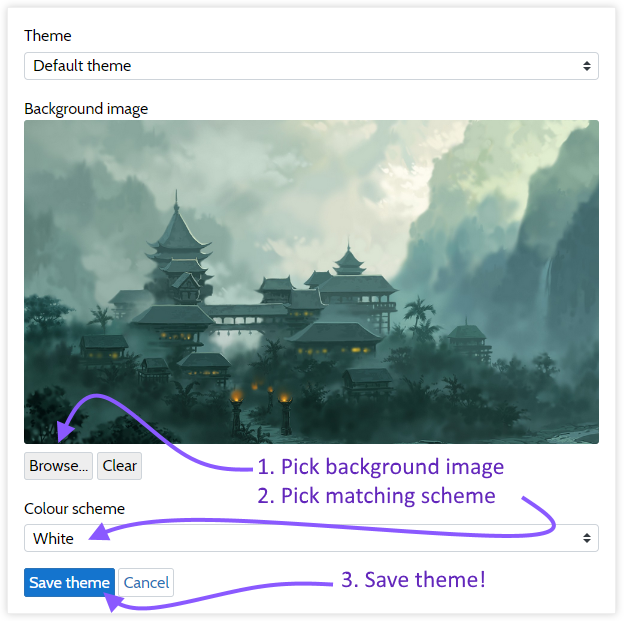
This week we finished the first set of colour schemes!
We have now added the first four colour schemes: Green, Autumn, Ice, and Desert. Next to these four the infamous default colour scheme has been dubbed “White” since it features a lot of… well… white.
To customize your campaign with these colour schemes, visit the “Theme” section of your campaign configuration:
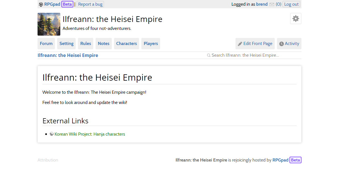
After saving your theme configuration, you will immediately see the effects of the changes on your campaing:
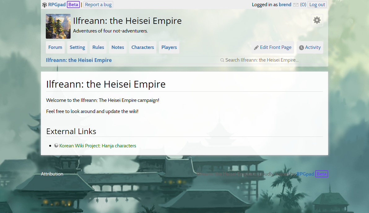
During the development of the colour schemes (and the technical structure to support them effectively) we discovered that certain types of background images seem to work better than others:
- Background images without a lot of contrast work best. If very light and very dark areas a directly next to each other, they tend to make the page text difficult to read when the text is over such a contrastful area.
- Background images with a single dominant colour work better than images with wildly differing colours. The demonstration background above is a good example of a background with a dominant colour.
- Backgrounds that are “calm” in the middle and have most of their details to the left and right side work better than backgrounds that have a lot of detail in the middle.
However, we have obviously not tried All Backgrounds™, so there might be exceptions that work out beautifully! If you find them, or if you have a suggestion for a colour scheme, please let us know in the community forums.
Over time we will improve the current colour schemes, and add additional schemes that you can use to customize your campaing site with so that if fits the atmosphere you are trying to set for your setting and campaign!
While very small, we also present this week’s changelog.